STATEMENT OF INTENT
What is the theme?
The theme I'm looking into is messages to show words can be expressed through images. Personally, I have a passion for photography and this theme allows me to express my opinion through a photo. I also chose this theme because I think mental health still is stigmatised everywhere, I think this could spread awareness to anyone who sees this and it's important to know about considering everybody you know and you have mental health (healthy or not). I hope to take mainly portrait images to show emotions of the people, potentially write on their faces with typical insults to those with mental health like 'man up' to show they are not true and outdated phrases that affect millions daily. I think this theme will allow me to be creative and learn.
What artists will I research and why?
One artist I hope to research is Barbra Kruger since her work is a prime example of what I'd like to achieve. She has her own style of red borders, white writing and bold messages. I think she is a quite good inspiration for anybody really, during this time (50's-60's) when she made her work she was never afraid to put her work out there- especially feminist and mental health art. I'd like to do some work inspired by her but have my own spin on it, so it's still my own.
I will also research Edward Honaker since he's a widely famous and inspiring male mental health photographer. Especially men experience discrimination for dealing with mental health which is why I'd like to learn about it through a male artist. He uses photoshop to manipulate what is going on in his head and isn't scared to show that. For example, he creates swirls over his face to show he doesn't really know who he is when battling with depression for so long.
The final artist I hope to research is Doma Dovgialo because in my opinion he is the most expressive of the three artists. He gets the models involved and asks them to draw what is going on mentally with them, it is very different and creative to do this in my opinion. It feels more realistic too. For example, one model had scales over his shoulders to show he feels as if stuff is weighing on him. Drawing on top of the printed image also gives a 3D effect which would definitely be beneficial to my project since it will stand out, therefore the message does.
What photoshoots do you intend to complete?
To show progression through my work I will start by photographing people using a prop of a mirror, inspired by Barbra Kruger's most famous piece where the model's face appears shattered. I think this immediately links to my theme and research. Next I will do something similar to Edward Honaker and then Doma Dovgialo (using photoshop along the way) to take my work on a journey but also link it efficiently.
Eventually, I'd also like to do a photoshoot where I print out the image and use it that way.
How am I going to experiment/what equipment?
To take my photos, I'll use my mobile phone for home learning and in school I will use a DSLR Canon Camera which is manual to get the best quality photos. Since I'm interested in portrait images, a reflector may be a good prop to use since I can get a harsh white light on the face, to show it's a bold message, not soft yellow. One effect I am interested in experimenting with is like Edward Honaker, slowing down the shutter speed to get an almost moving head effect. In photoshop, I may use text on the people saying 'mental health matters' or finding inspiration from the mood boards I create.
Experimenting with black and white could be good since Barbra Kruger does that too. I'm interested in pushing myself further on photoshop and creating some magazine style photos for my final gallery.
Also, I would like to take my work further by not just digital photos, but physical. By printing out images and creating either posters or installations to show my work is inspired by Doma Dovgialo but also it makes the message (my theme) come to life.
How will I show progression?
Ideally, I would like to get my mood boards and mind maps done in one lesson so I have more time on the actual work. Before I start to take photos, I will create my shoot plan to show the steps and equipment I intend to use (for each shoot I do). Finally, I will develop it on photoshop and develop it from there. For example, if I add text to an image, to develop it I will make the text 3D. This will take my work on a journey and clear to the viewer what I have done. This will clearly show progression, especially within my final gallery, I hope to have more outcomes in the end than my texture project.
What do I hope to learn?
As previously mentioned, to annotate my work throughout my webpage I will label my ideas to show what I've intended to do. An example of this is my shoot plan, doing so you don't just see the photos but you see why I took them which is beneficial to the theme of messages. Another example is that with photoshop, I'll list the steps in to how I got the result I wanted (like create clipping mask etc.). This will help the examiner see how much effort I have put into this outcome and it also helps me since if I wanted to recreate the effect, I could follow my own steps. If something went wrong, I could see where I have gone wrong since it's all annotated, this will help reflecting on what I need to do next time to prevent it and it going well next time. I hope to learn more about mental health through this project because everyone has mental health.
Coggle Mindmap

Mood Boards


BARBRA KRUGER RESEARCH

COMPOSITION:
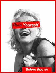
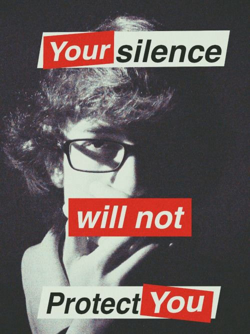
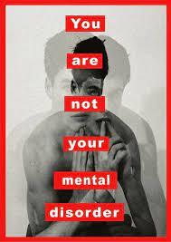
This image was created by Barbra Kruger, it is one of her most famous pieces. The image is black and white which is apart of her style. The black and white is used to make the rest of the text and image stand out. Personally, the first thing I noticed is the cracked mirror on the woman's face as it is quite creative, the bold message behind the crack symbolizes that the models view of herself has been shattered by society.
As a viewer, I can tell Barbra put a lot of thought behind how to achieve this look, it can also be interpreted as someone with a mental health problem views themselves as broken and shattered because they have fell in pieces due to the problems they face everyday. The best thing about her work is that it is open to interpretation, she wants to send a message directly to who needs it. For example, the strong pronouns 'you' and 'yourself' is commonly used throughout her work and makes it feel personal to whoever is reading it.
The bold text has been edited to stand out and stick with you, a short and snappy quote will speak volumes to the reader. We can see small details like the woman holding onto the glass, as if she is trying to pick up the pieces but doesn't know how. Not only is her work catchy to look at but the small details are also relevant, this proves as a photographer and artist she is thinking about the position of the model, the effects she will add (text and black and white filter). We also wonder how she managed to take the photo of the mirror and if it is a photoshop effect or not, it is mesmerizing to the viewer.
Another striking effect is the shadows used around her face, it represents the dark meaning behind the photo but also creates contrast between light and dark and is called the depth of field. The background is pitch black so you are not caught off guard to the powerful message you're seeing in front of you, this piece and like many others has been very well crafted.
CONTEXT:
"Barbara Kruger (born January 26, 1945) is an American conceptual artist and collagist associated with the Pictures Generation. She is most known for her collage style that consists of black-and-white photographs, overlaid with declarative captions, stated in white-on-red Futura Bold Oblique or Helvetica Ultra Condensed text. The phrases in her works often include pronouns such as "you", "your", "I", "we", and "they", addressing cultural constructions of power, identity, consumerism, and sexuality. Kruger's artistic mediums include photography, sculpture, graphic design, architecture, as well as video and audio installations. Kruger lives and works in New York and Los Angeles. She is an Emerita Distinguished Professor of New Genres at the UCLA School of the Arts and Architecture." - Copied from this website linked here.
CONNECTION:
This photographer is a perfect example of the 'messages' theme as she spreads a very powerful message about femininity, greed, political movements and even mental health which is what I aim to spread a message about the stigma around mental illness and wellbeing.
A lot of her work, even the image above is relevant to my theme and I hope I can make similar posters to hers using photoshop. She spreads messages like 'You are not your mental problems' 'Mental health is a battleground' 'How much does perfection way?' and many more artworks that will inspire me when taking and editing photos, she will be kept in mind.
Her work will be a main inspiration during this theme so she is definitely relevant to my project this term in different ways.
COMMENT:
In my opinion, I think she is a very bold photographer especially considering some of these messages would be seen as radical in the 1940's as many people would be scared of sharing their feminist values and I can imagine she inspired a lot of women during the time, this is the type of photographer I'd like to research and I am excited to take photos in her style. This photo particularly is one of my favourites by her because I like how it has different meanings, others I like have to be those with the red texts as it is bold and catchy.
EDWARD HONAKER RESEARCH

COMPOSITION:
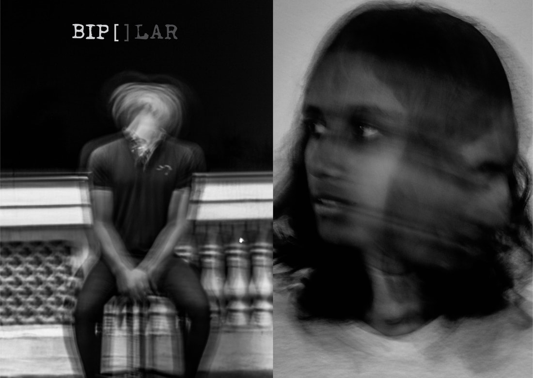
This is a self-portrait black and white image created by Edward Honaker. The first leading line to me is of course, the blurred face. It definitely stands out because it looks messy and doesn't really fit in or be what you would expect. However there is a meaning, Honaker's clear intentions were to try display what is going through a depressed persons mind. He feels as though he doesn't blend in with society due to his mental illness. Another thing that could show this relates to depression is the fact it is an all black and white image because it makes the photo more intense and emotional. There is no pop of colour making it seem as though Edward wants us to see it as dull so we understand the mindset before he took this image without any distractions of colour because warm bright colours would represent joy and happiness, whereas the aim here is for a melancholy feeling and tone to the viewer. Black and white looks interesting to me because it removes any distraction of colour and helps the viewer focus on and emphasizes the message/effect/patterns of the photo.
This image shows depth of field which means the distance between the object and the lens and how much focus, there is a clear focus on Edward. This photo was taken at eye-level, this makes an image more interesting for me because it's almost as if you're looking at it in real life understanding his mind.
Although it has clearly been edited and warped on his face it is still a realistic image of a person.
There is a slight vanishing point in each corner in my opinion, this is called the gradient effect.
The gradient effect slowly fades out the image into a black border and may have been used to balance the exposure across the image. The lighting is studio in my opinion as it isn't bright or soft but not too dark either. It is able to catch the mood and depressing vibe of the image but not too dramatic.
CONTEXT:
"A young photographer battling depression has captured his torment in a powerful series of self-portraits as a way to share his internal suffering and raise awareness for those with similar struggles. Edward Honaker, 21, from California, was diagnosed with depression and anxiety two years ago, but up until that point he was confused by his crippling emotions. After learning the cause of his persistent melancholy, he turned to his camera to document his personal experience.
'It's kind of hard to feel any kind of emotion when you're depressed, and I think good art can definitely move people,' he told the Huffington Post of his picture series." https://www.dailymail.co.uk/femail/article-3240571/Photographer-suffering-depression-captures-mental-illness-haunting-series-self-portraits-raise-awareness-disorder.html
CONNECTION:
In my opinion, this photographer is an amazing representative for men's mental health and definitely links to my theme Messages because he has a very strong message of stopping the stigma. This photographer is that he wants to change the phrase 'Be Strong's' meaning, stereotypically society tells men to be strong and quiet about mental health. Edward says 'Be strong' and be strong by standing up to society and spreading awareness to end discrimination rates, especially for men.
COMMENT:
I fully agree with Edward and changing the meaning behind 'Being strong' for men, I think his work is very open and real to those who suffer from similar things to him, making those who already feel lonely less alone. I think his images are so creative and I hope to create images like him in this project, I like how there is no direct message / text on it but you can look for the deeper meaning if you choose to research it. One thing I want to experiment with is the blurred face effects as I do think it stands out a lot.
DOMA DOVGIALO

COMPOSITION:
This is an image created by Doma Dovgialo as a part of a project on mental health which was made into a photobook. This photographer focusses on the message rather than the aesthetic of it, while doing this she created her own style. A black background is always used and dark clothing, this gives the artist a chance to experiment with contrast, this has successfully been achieved because you are focusing on the art, not a distracting message. The model, Andrew is on a 3/4 view, this is because it is versatile meaning you can draw around his face. Andrew is not looking directly at the camera and Doma Dovgialo may have done this to suggest a lack of confidence in his face due to his depression and unhappiness with himself. The lighting is portrait facing the same way as the camera, making it look 3D. In my opinion you can clearly see it had been taken in a studio shot, but it is at eyelevel so it looks like still life. Behind this image there is a very important message which is mental health is the same as physical health, only you can't see it. All of this is going on in Andrew's head but you'd never notice. The deep maroon scales represent weighing up how much pain he would get from doing one thing versus how much he would gain in the long run. It’s an uncomfortable set of scales to be holding, he wants to let go of them but they're too heavy. Another leading line is the large burgundy dragon above him. Andrew says this represents escapism, he is one of those people who plays Dungeons and Dragons and fantasy stuff. Rather than having to think about important things in reality, it creates a different world where you can do whatever you want. Doma allowed his models to express themselves in any possible way to fight the taboo of mental health, she wants to inspire others to speak up, including adults and younger people.
CONTEXT:
All information from fragmentary.org/dominika-dovgialo/
"Dominika Dovgialo is a Polish-Lithuanian photographer based in London. Her interest in mental health can be traced back to her school years where she took on a Peer Mentor role; someone who listens and tries to communicate to other students who are struggling. Dominika studied a Philosophy BA at King’s College London, developing her interest in identity, morality and the awareness of other minds. Completing an MA in Photojournalism and Documentary Photography drove her to try new things and approach topics in a more creative way. "Around 450 million people currently suffer from neurological disorders, placing mental disorders among the leading causes of ill-health and disability worldwide. While physical health is both easily identifiable and spoken of, mental health still remains in the background like a mute elephant in the room. " "
CONNECTION:
In my opinion, this photographer is relevant because she is a mental health photographer but also would like to get her message across. She developed this project throughout quarantine, it is modern, new and realistic up to today. She inspires young people (not only adults), therefore I think Doma Dovgialo is certainly relevant to my theme. Also, she is from England, which makes it less of a random photographer to research,
COMMENT:
I like this photographer because she gets her models involved with what they're going through and listens, she represents their feelings in such a creative way which must make millions feel inspired. I hope I can take some portrait pictures like hers, print them out and maybe draw on these photos, the colours add a very nice contrast to the black background in my opinion.
First shoot plan
My theme will be black and white for now and I will be taking inspiration from Barbra Kruger, similar to my mood boards who creates a black and white image and a bold red and white text on top and border. I will use the font Furtra Bold Oblique like her using photoshop. I will start with photos of people maybe in front of a shattered mirror. I will use a manual camera setting on a Canon DSLR.
|
Text I might put on these images I take could be; ' Mental health should be treated as physical health is.' 'Mental disorders are not adjectives'. 'You're more than your mental disorder'. '1 in 4 experience a mental health disorder'.
|


Test one
Overall, I am glad I have practiced taking photos and I am lucky for the shattered mirror prop and black background. However I personally am not too happy with how they came out. I think the uniform is distracting and the lighting is yellow and I didn't really get the right facial expression on the models. Next time I will spend more time on it and use a camera instead of my phone.
Out of all the images, these are the best in my opinion since the background is darker, it is in frame and clear of what I was trying to achieve. In the second and third image the model is posing to show the emotion she is upset or hurt, this is what I was trying to show and I think them two photos show it.


Worst
In my opinion this is my worst selection of images due to the fact you don't get the Barbra Kruger style from them. Most images are out of frame and the light is coming through creating a distraction from the model and shattered mirror.
In my opinion this is my worst selection of images due to the fact you don't get the Barbra Kruger style from them. Most images are out of frame and the light is coming through creating a distraction from the model and shattered mirror.


Shoot plan 2
|
For this project I will need to take studio shots in school with portrait lighting.
I will use the camera on the TV setting for the blurry effect like the picture in the mirror and will give me the chance to experiment with shutter speed. For some images, I may experiment with lighting, like the Tencent lighting setting or even only showing light on one side to show a darker side for contrast. Possibly like blue lights as you can see in one image. For this shoot I'd like to use colour and mainly focus on the photoshop affects. I will look for tutorials that can create dispersion, warp faces etcetera. This shoot is heavily inspired by Edward Honaker, who I have previously researched as you can see above. |

|
|


Best and worst

|

|
|
I think that this is my best image because I have achieved the blurry effect I aimed to have and the model is clearly looking the correct way. The background is non distracting and plain.
|
I think that this is my worst image because it is not the right kind of blur I wanted, she isn't facing the right way and I set the exposure too high.
|


I think that this is my best image because the model has a light shining on one half of her face which is similar to Edward Honaker's work. There is no distractions from the background or a school uniform. I think this image will be easy to manipulate on photoshop.
|

In my opinion this is my worst image since I had set the exposure too high and the jumper is very washed out, you can also see behind the black backdrop which is unprofessional looking. I was trying to achieve the blurred face effect but it was unsuccessful in this image as the jumper is also blurry.
|
Magazine effect on photoshop

https://www.youtube.com/watch?v=a8LL_T8nl6Q


Magazine effect 2

I didn't use a tutorial for this as the shutter speed/moving head effect was already created when I used the camera.


Shoot plan 3
|
My theme will be portrait in colour. I will be taking inspiration from Doma Dovgialo, like my mood boards I aim to print out the portraits and then draw text shapes on them, like the images to the right. I will use a manual camera setting on a Canon DSLR.
I'd like the lighting to be quite harsh white, not a soft yellow since it distracts you from the model or what the message on them will be. I may use the white reflectors to light up the models face. For this I will need a model not in school uniform because it doesn't reflect them and it looks very unprofessional in my opinion. |

My theme is about the stigma behind mental health and phrases like 'attention seeking' is something I'll write on it.
|

|


Best and worst images

|

|
|
In my opinion, this is my best image as it is the type of image I described in my shoot plan. It is not out of focus and there is a portrait background therefore no distractions for the viewer. It's a basic photo and pose however will be useful when printing out/ editing text on the picture.
|
I think that this is my worst image due to the clear fact it is out of focus and the entire photo looks fuzzy. In my opinion it is a low quality image. The model is not posing and the image is too zoomed out for a portrait picture. Due to the blur you can't see the text making it look like a smudge.
|
Printing out the images


Shoot plan 4

|
To get it more accurate than last time and take my work on a journey, I will use a black background with portrait lighting. I will take these photos in my own time and use a friend- not in uniform as my model. I will aim to use the school Manual Canon DSLR Cameras.
|

Similar to shoot plan 3, I want to continue to be inspired by Doma Dovgialo but potentially take it further by drawing on an iPad digitally and recording it like a timelapse. Similar to his work on this website : https://www.bbc.co.uk/news/resources/idt-sh/portraits_of_the_mind Where you can see the drawings appear on the model.
https://www.domadovgialo.com/portraits-of-the-mind |


First, I had to practice, I realised I didn't like the landscape images and needed to adjust the lighting.


Best and worst images

I think that this is my best image as it captures what I was going for which is a dark image, focusing on the emotion of her phase which relates back to the 'Mental Health' theme since you see what she is feeling. The dark background also helps along with the models dark hair not adding any light to it. It is also in focus and catches your eye to it, the lighting is just right and shining towards her face.
|

This is my worst image because as you can clearly see the light shining from under the models face is too close to her creating an overexposed image. Next time, I'd need to ensure the lighting isn't too close and creating shadows where they don't need to be, like in this image for example on her nose.
|


Best and worst images

I think that this is my best image because of the posing done by the model. Her mouth is covered that could potentially show she has been silenced by the media or even scared to speak out. The red can represent anger and fury, and in my opinion the lighting isn't too harsh on her.
|

I think this is my worst image because I took the photo at the wrong time as you can see the model doesn't know where to put her hands and also what expression to make which shows I should direct models better in the future.
|


Taking it to Photoshop (Practicing before iPad)

For this I practiced drawing and using text before doing on an iPad and I found it was harder to draw on a PC rather than in real life/on an iPad. I did a magazine inspired one talking about society similar to the one shown in my shoot plan.


|
Similar to shoot 1, I want to continue developing the style of Barbra Kruger using photos I have already taken
|
|
|
|


Digital project

|
For this project, I think the best outcome would be to use the app procreate on an iPad and create time lapse how they do in this video https://www.youtube.com/watch?v=MAos8yZsIZU
I feel that this app can help me work similarly in the style of Doma Dovgialo, I will use my images from shoot 4 to draw on |

Shoot plan 5

|
For this shoot I'd like to take Edward Honaker inspired images at home. My model for this will be my brother since I need to represent males mental health. I will take photos on my iPhone. Inspired by him, I will use Picsart to edit my photos by making them Black and White and distorted.
|

|
Final Product


Shoot plan 6
|
First, I would need to take photos of a preferably male model to focus on men's mental health on a Canon DSLR and a black background. My main inspiration will be the photo on the right. Next, I will edit the images on photoshop inspired by Edward Honaker.

|

Thedots
|


Shoot plan 7

|

|
For this shoot, we worked with a professional photographer with hopes of recreating the image above
The camera used was connected through the laptop meaning we didn't he to click the camera button
Equipment also used was a black background, colourful gels, laptop, lighting, chairs.
The gels were important as we had to work out what goes where and how strong; the yellow is behind the model, red was on the right of their face and blue on the left.
Since I am exploring mental health, I made sure the models had a sadder, non happy expression.


Adjusting the lighting
Here you can see we had to work with Justin and change the power of the lighting to our liking, at first the gel was too dark and you couldn't see the models face until a purple light was added


Outcomes


Best and Worst

I think that this is my best image because as you can see the light contrast between the red and blue is directly down the middle, similar to the inspiration photo above, she is also stood in the same direction. The contrast of the vibrant colours against a pitch black background brings this image together in my opinion.
|

In my opinion, this is my worst image as it was taken when experimenting where to angle the camera, as you can see the model is too close to the camera. Also, it is not centered it is way too much to the left and the face is half being cut off, after this we decided the model should sit on the chair to get the angles right.
|
Experimenting with Pixlr


Mock exam

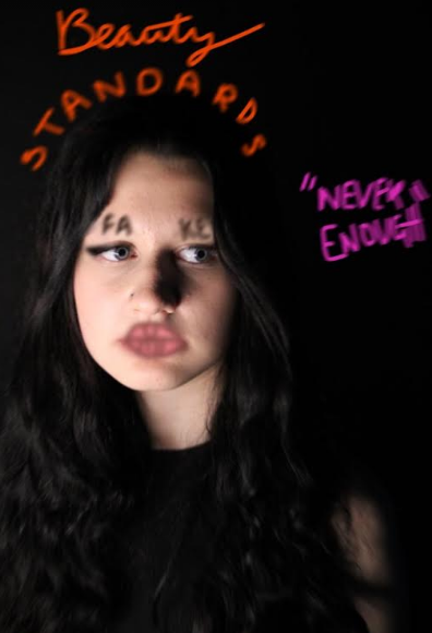
|

|


What went well here in my opinion is the curved text, I feel it is something Barbra Kruger would have used in her artwork ("Fake it till' you make it"), it is important to link to your research because it sends you on a clear path to do well.
Although, I feel as though I could have improved on the mask, if I could go back now I'd definitely had made it fit her face more, less straight and more curved.
In my opinion this fits my research but also has my own style on it, for this I was inspired by Barbra Kruger.
Although, I feel as though I could have improved on the mask, if I could go back now I'd definitely had made it fit her face more, less straight and more curved.
In my opinion this fits my research but also has my own style on it, for this I was inspired by Barbra Kruger.
2- Barbra Kruger inspired


Final Gallery


TIME LAPSE VIDEO
|

|

|
| ||||||
Evaluation
1. My main theme was messages where I explored mental health and the stigma behind it. I was interested in this theme because I was able to take portraits of people, in contrast to the Texture project and was able to look for deeper meanings behind images. It allowed me to be creative and plan how to make someone show emotion, the colour psychology behind mood (anger could need a red light) and how to manipulate the image to get a certain feeling or tone. I was able to expand my learning as in psychology I also study mental health, I was able to visualise it through photography and learn so much more.
2. The most intriguing part of this project for me was how I want to display my images in my final outcomes. Using not only Photoshop but also the iPad app Procreate too to make a film and drawing on my images allowed me to be extra creative and let me display my images in a way Photoshop couldn’t.
3. Undoubtedly, the new technique I was able to experiment with had to be using an app on the iPad, Procreate. I had to learn all of the new brush settings, how to blend and select colours into my work. Traditionally, photography is digital or perhaps printed out but I created a timelapse of my drawing, inspired by the work of ‘Doma Dovgialo, the work of the quarantined mind.’ First I needed to plan my shoots, black backgrounds, who'd model, the poses etc. Next, I practised what I would draw in photoshop and recorded the process of my work. Finally it was time to use the iPads which took a lot of practice to capture what I wanted on an unfamiliar app, I’d never used it before.
4. In my opinion, the technique I need to develop further is taking more photos. I find that I never usually take a variety of photos, usually there are lots and lots but of the same angle or pose, and afterwards I wished I experimented with more poses and angles and lighting techniques. For my next project I would like to study editorial photography as the models always have unique style, makeup and extreme variety of different poses you wouldn’t usually see in basic portraiture.
5. For my research, I looked into three different photographers. My first was Barbra Kruger, she had very strong messages and her own red, white writing and a black and white photo style. From her, I decided I wanted to have bold messages just like her, but make it my own and in relation to mental health, whereas hers were a lot about feminism and politics during the time. Secondly, I looked into Edward Honaker who documented his depression struggles through a self-portrait photoshoot, black and white photos and different kinds of effects. This photographer inspired me to look into different effects and tutorials in photoshop. Finally, the photographer I took the most inspiration from was easily Doma Dovgialo, by his work I was intrigued by the idea of drawing on your own images instead of editing them or adding text to it. I made it my own though by mainly sticking to the colours red and white, not all colourful like him and also I made it into a time-lapse film, so you can see the process of me drawing.
6. Doma Dovgialo has heavily influenced my photographs because his work taught me you can draw on images and be creative. I thought considering I am exploring mental health which is personal and unique to one's mind, it fits perfectly. I also loved the sleek look of Barbra Kruger's work as her colour palette became her signature move. Altogether I combined them by drawing on my messages and adding my chosen colours and borders.
7. The technique I have enjoyed the most is drawing on the iPads as that's where I felt most inspired and creative as there’s unlimited brushes, endless colours and styles I can draw in. It gave me many outcomes and it was fun creating so many, overtime I became more confident with this tool
8. The most successful part of this project for me is working with the professional photographer, it helped me learn so much and I loved the final outcomes. It nicely impacted my final gallery and had a big impact on my theme, it all came together at this point in my opinion. I was able to explore the colour psychology in more depth using colour gels and the settings on the laptop and camera. We mainly used blue, which can definitely be used to represent sadness and which is what I needed to show since I had already done purple for confusion and red for anger.
9. Problems in this project for me would have to be managing my time, what to do with it as this year I have missed a few lessons due to being ill which could have made me fall behind but I have tried my hardest to stay focused when I am in, hopefully this is represented through my work. I feel as though if I was in more lessons, I would have more outcomes and photos taken.
10. As previously mentioned, I practised a lot with Photoshop before using Procreate. I would use research to find inspiration for what kind of outcomes I wanted to achieve and how to make them look good. Photoshop showed me what might go wrong. For example, where to put my text and if my message will not look good on that specific image.
11. If given the opportunity to restart my project, I would practise more at home shoots to learn more about the possible different angles I can use, or perhaps bring in my own props and makeup for the models to wear as it would have definitely made my theme look more creative. I am happy with the way it turned out, but there’s always room for improvement.
