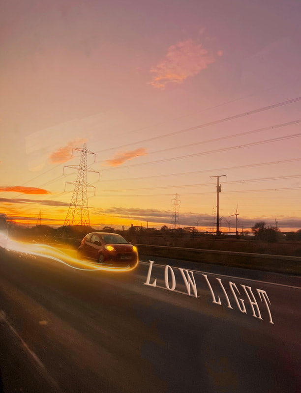
STATEMENT OF INTENT
WHAT IS THE THEME?
I aim to produce a website of work demonstrating my ideas, development, creative work and reflection based around the theme of the ‘Low light.’ At the end of my coursework time, I will choose my best photographs and present them in a final gallery. I believe the theme 'Low light' is quite broad and will allow me to experiment with whole new levels of photography I have not yet explored, for example I haven't ever taken dark photography including neon lighting before. An area I find interesting is light trails, I feel as though it would be a challenge for myself on photoshop.
WHO WILL I RESEARCH AND WHY?
For my initial research I will start by looking into 'Low light’ photographers. At the moment, I have three in mind that I want to look at. These are Lindsay Alder, Liam Wong and Jan Staller . I chose Lindsay Alder because she’s a portrait and fashion photographer that displays the art of working with shadows and dark lighting and I think that I can gain a lot of inspiration from my own work.
I chose to look at Liam Wong’s as his work focuses on capturing the beauty of the night time and making it artistic and colourful. Specifically, I was intrigued by the Tokyo nights photo, I really liked the reflection of neon lights onto the puddles and thought I could potentially create something like that. It will also allow me to work in ‘close-up’ and I could try using a different lens.
I also hope to look at the work of Jan Staller and in particular his series of ‘Urban Landscapes’. I feel that his work is abstract and beautiful and will inspire my own photography. I feel as though some of his work is a good foundation to start with, like his photos of the night sky may be easy to recreate.
MY INITIAL THOUGHTS?
When I chose this theme, my initial thoughts were of urban landscapes such as cities, puddles, streetlamps and neon lighting. After thinking about the project title more thoroughly I realise there are so many more routes for my work to go down such as studio low exposure shots even done in studio, like candles and matches. How I could combine and contrast the different variations of lights and if I could do studio shots as well as going outside on location. If I get a range of different colour lighting, this will allow me to have more images to experiment with and exposure, once refining my work in Photoshop. I think my main idea will be outdoor shots though, as studio lights with this theme can be limited.
MY NEXT STEPS
To show progression through my work I will start by photographing the natural things outside like sunsets. I will then develop these images further by taking more ideas from them and editing them in Photoshop. I then hope to venture from within Manchester/Wales and gather night time images from the environment around me. I already have a lot of ideas running through my head for this project which will propel me in the right direction. One of my goals in photoshop is to take my work onto a journey and try anything.
WHAT EQUIPMENT WILL I NEED?
For studio shots with artificial lighting such as candles, I believe I will need to use a CANON DSLR school camera to help me catch the authenticity of it and experiment with different lighting. To focus fully on the studio shots I'm sure I'll use the black background props to keep the low light theme throughout all my work.
However, when I am out on location shoots I will use my iPhone 13 to take these images and try experiment with my camera settings on there to achieve a good photo.
MY TIMELINE
I have from January to April to produce my Website of work towards the production of my final piece. I aim to complete my initial research within the second week and start photographing by the third week in order to give me the time I need to show progression. I will then continue to develop my work in photoshop and be prepared to go out again with my camera and capture new images to enhance my project. When I have completed the project, I will select my best photography outcomes and display them in my final gallery.
HOW WILL I EVALUATE MY PROJECT?
As my project progresses I will use annotations throughout my webpage labeling my ideas and development clearly. For example my best and worst annotations. This will also help me to reflect on the work I produce. I will mainly seek advice from my teachers and my peers on how to make my work better, as I’m always aiming to push myself to new levels. I will also watch tutorials and demonstrations and find my own as well to help me develop my skills and knowledge of Photoshop. After the creation of my final portfolio I will write a final evaluation on the project as a whole, reflecting on what went well and what I would do differently or change given the time.
COGGLE MINDMAP

MOODBOARD 1


MOODBOARD 2


LINDSAY ALDER RESEARCH

COMPOSITION
From this image the leading lines here for me personally is the strong blue tint to the image, this image was carefully crafted to capture the dark shadows and the shimmering highlights of the model. Especially on the shadow of the models cheekbones and hair but then is contrasted where it is light like on the jaw and shoulder. This not only makes the model look more defined, but the image itself is more intense and sharp. Perhaps the photographer used gels to create the blue look and adjusted the lights to their liking, blue is a moody colour and typically represents sadness, this creates a sense of sorrow into the image from my viewpoint. I also think this photo could be considered to be monochrome with all the light and dark shades of blue.
Secondly, in my opinion the photographer has used the rule of thirds by centering the models face to draw attention to it, the way the model poses it is almost as if they are thinking of something which makes the viewer question what that could be and makes the image deeper in the sense that if it has something to do with the blue atmosphere Alder has created. Most importantly, the photographer has used low lights in the photo which is a technique you could create by lowering the exposure to remove the light sensitivity and unwanted shadows, this also prevents a grainy look in your image but also increasing the contrast of an image to create a sharp and dark look to your image which will nicely bring out the colours. hues and contrasts.
CONTEXT
Lindsay Alder is an American fashion photographer based in New York. She has worked for; Zink magazine, Bullett Magazine, Popular Photography and even published two books about photography, in 2020 she became the first ever woman to win the Rangefinder Icon of the year. "Lindsay is one of the famous and trending celeb who is popular for being a Photographer. As of 2018 Lindsay Adler is 32 years years old. Lindsay Adler is a member of famous Photographer list." - Lindsay Adler Beauty Photographer - New York City (lindsayadlerphotography.com)
CONNECTION
While it is clear Alder's work is impressive, the reason I am researching this photographer is because she is able to capture low light using portraiture which is something I would like to experiment with (but also landscape, scenery photos), making sure it isn't too similar to my previous theme mental health. I think her work will help me try low light on models as she has done many inspiring photoshoots on it.
COMMENT
Overall, I think this photographers work is inspiring especially since I'm also interested in editorial photography, I'm glad to be looking in to her work to research. I will make sure to reference her throughout my GCSE as I have also included her work in my mood boards. This image specifically, captures all the harsh and soft colours in all the right places. The shadow detail is something I'd like to recreate whether it is portrait or landscape.
LIAM WONG RESEARCH

COMPOSITION
From this image I can clearly see a vibrant night time city photo. The first thing that catches your eye, the leading lines, is the strong colours of magenta and cyan, slowly meeting in the middle reflecting off the buildings creating contrast and depth. Perhaps Liam Wong used the natural lighting then enhanced. While there is many bright colours, it is not overloaded, we can see silhouettes of people all of them carrying umbrellas, this adds a theme to Liam Wong's photo. From this image it almost looks like it is raining purple and blue in my opinion as it is shining and the dramatic, strong and crafted people are all holding up umbrellas to protect themselves from it. They all look as though they are in a rush to leave, it makes the viewer question where they are all going. I can see this photo is also taken at eye-level to the viewer, this makes us feel like we are apart of the image and can see all the bright colours of the city. The depth of field in this image for me is how close the person with the umbrella is, compared to how far the buildings are from him. The clear rule of thirds for me is the person closest taking up the left third of the photo, I think this is better than putting them in the centre as it would distract from the bright buildings which I think are the most fascinating part of it.
CONTEXT
Born: Edinburgh, 1987.
Training: Art degree from Abertay University, Dundee.
Influences: Syd Mead, Hideo Kojima, Wong Kar-Wai, Roger Deakins, Fan Ho, Henri Cartier-Bresson, Saul Leiter.
High point: “Connecting with people through photography.”
Low point: “Lacking the confidence to pursue art as a career.”
Top tip: “Find your voice – seek all of the things that inspire you and create something wild.” -Liam Wong's best photograph: a moody moment in Tokyo | Photography | The Guardian
CONNECTION
Liam Wong's work will definitely inspire my work heavily as I intend to create low exposure dark photos with contrasting deep tones (landscape photos) and I can also learn to edit like Liam Wong on photoshop to create the bright colours to bring out the hues. For example, shoot plan two is inspired by Liam's work but I do however want to make it my own and perhaps take some more close up's of the town unlike Liam where his are zoomed out, lots to focus on and doesn't always have a clear leading line or rule of thirds, however this I feel makes it look less like a photograph and more like a piece of art. This gives me the idea that I could potentially go out and take photos of my own using this idea of a puddle reflecting colour.
COMMENT
In my opinion Liam Wong is a creative night-time photographer who is able to enhance his lighting and create energetic colours in his work. His photography is very famous and especially known for his Tokyo images, while I can't go to Tokyo I still find his images as something to take inspiration from.
JAN STALLER RESEARCH

COMPOSITION
The strong leading line in this image for me is the painted road leading up to the horizon and leading up to the strong deep ocean blue sky. This image has so much depth it makes me consider if this photographer, Jan Staller used a wide zoom lens as the centre is so straight yet the sides look almost extended creating a depth of field along the sides in contrast to the straight along centre. Along the way, your eyes are met with traffic lights and also streetlamps guiding you to the end. Almost like an illusion, closer to the sky the lights appear smaller.
Blue is a moody colour and typically represents sadness, this creates a sense of sorrow into the image from my viewpoint. The cerulean sky to me also indicates the photographer thought about the time of day to create this to craft that perfect moody sky, I feel like it was taken just after sunset perhaps 6-7pm to get the strong lapis blue evening sky. The ambient light adds a lot to this photo in my opinion; a dramatic feel surrounding the streets.
The flares of the streetlights bright white flash creates a sequence or pattern in the image which makes you look deeper into the image, this technique is a depth of field considering it adds dimension, distance and depth.
If you look closely you can also see a slight vignette, the centre being the lightest and dark around the roads further pushing the 'Low Light' theme. As you can see if you zoom in, there is a slight lens flare near the grid on the bottom of the image. In my opinion, this was done purposefully to invoke a sense of drama into the image. It follows the standard pattern of red, green and blue. This is a small detail which I think was done as only those looking closely would notice it, Jan Staller wants to attract other photographers to see his work. The more obvious lens flares are on the vertical lampposts following your eyes down the street (the depth of field).
CONTEXT
" Jan Staller is an American photographer who captures imagery of urban landscapes that focus on patterns of highway graveyards, unfinished buildings, and ongoing construction sites. Jan Evan Staller was born on May 27, 1952, in Mineola, New York, United States. For more than 35 years, Staller’s photography has traced a trajectory from uncanny urban landscapes to bold abstracted studies of industrial materials. Moving to Manhattan in 1976, Jan Staller began to photograph the world closest to his home: the West Side Highway. It was there, working with a mixture of natural and artificial light, he made his influential twilight images of New York City. Over the years, he has expanded the regions of his work. " - https://www.featureshoot.com/2015/04/eerie-photos-reveal-a-deserted-new-york-city-at-night-in-the-1980s/
CONNECTION
I believe Jan Staller's work will be a great foundation for my work, not only because you can tell he crafts his work to directly have patterns and leading lines in it. I'd like my work to be more intriguing to look at like his for example his black and white shoot including the patterns.
COMMENT
Overall, I think this photographers work is very underappreciated and talented, the colours this photographer experiments with will always stand out to me and I hope to achieve work like theirs. The patterns to me are the most interesting thing and actually inspires me to try do the same in my work, for example bokeh lighting could also be considered a pattern. I want to focus on low light photography, but this photographer makes me want to make it my own and work creatively. I like this photo as it has a special meaning to me since I've always loved photos of the sky and the strong moody colours reminds me of my previous theme, Mental Health (Messages). I will not do the same as my last as I want to be creative but it is something familiar to me.
SHOOT PLAN 1

For this shoot I would like to test portrait low light photography. I will do it in school using a model in their own clothes, so it is as dark as the inspired images I will hopefully be able to use PEXA as there is black light in there.
I will use a CANON DSLR for this shoot as I can experiment with different exposure and ISO to make it darker, but enhance the phone light. I could further enhance the light setting by increasing hues and contrast to make it sharper. I will take photos of Humera I aim to get atleast 10 photos of her. I want to try all different colours such as green, purple, blue and white. |

For props I will need a candle, lighter or a phone's light shining onto the models face.
Tutorial I might use: https://www.youtube.com/watch?v=uOUXDipWeN8 |
|
Experiment


Alternative experiment in PEXA


Experimenting in photoshop
I think that this idea links to my research of Lindsay Alder. However, I am glad I tried it but I don't think I want to take photos of people much further. Experimenting with the portrait images made me come to the conclusion that portrait photos do not fit in with my exam, I must focus on alternative shots now like the urban cities.


SHOOT PLAN TWO
|
For my next shoot, it will be a location shoot.
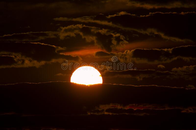
This is because I previously attempted portrait work and it did not work out. I will be going to South Wales this weekend when it is dark to hopefully get landscape city shots like Liam Wong or Jan Staller. I will also be going to Winsford and I aim to take some photos there. I will take the images on my iPhone 13 and experiment with decreasing the exposure on them. I aim to tale photos of the sunset, the sky, cars, streetlamps and more. When done, I want to take my photos over to photoshop to enhance the colours and make them look more moody and dramatic. I will also just aim for more yellow lighting perhaps on a park since I want to try this theme. 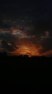
|
www.youtube.com/watch?v=INCdtgrP0pwhttps://www.youtube.com/watch?v=INCdtgrP0pw
|
|


Best and Worst
|
This is my best image in my opinion due to the composition. In this image I have used the rule of thirds to divert attention to the tree and the sun shadowing it. I think there is high contrast in this image between the silhouetted tree and the warm sky to the cool blue sky.
|
I think that this is my worst image due to the high motion/shutter speed in the photo. You can see that it is blurry and doesn't really have a rule of thirds for you to focus on. Next time I would hold my camera more still and plan what I want the image to look like. I'd focus on the sun rather than the trees.
|
Experimenting on Photoshop


More sunsets
These were taken in Manchester, not Wales on a tram station. I wanted to continue with the theme of sunset on a different location to add variation to my work.


|
|
For this shoot, I want to go out to local streets near me and take photos as I walk home.
Usually I will pass the Old trafford met stop where the university is, I may take photos of that or the trees or traffic lights on Great Stone Road. I will use my phone as it's easy to travel with I need it to be atleast 5pm where it gets dark currently (it's winter) This is clearly a location shoot I will plan myself. I do not need any models. These photos will hopefully provide me with what I need to manipulate in photoshop for my final theme, as I've not currently been happy with my outcomes I'm getting. |
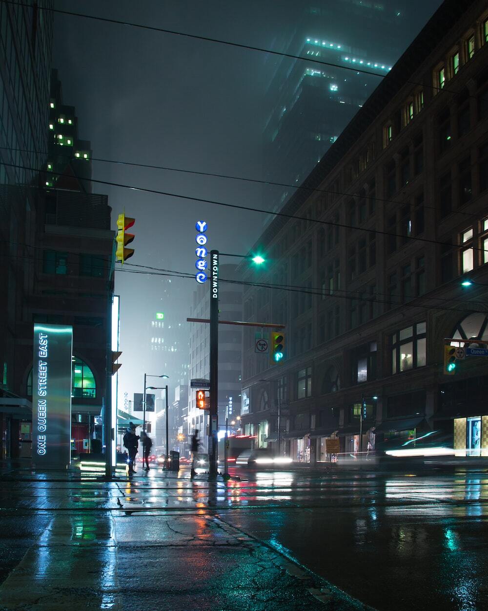
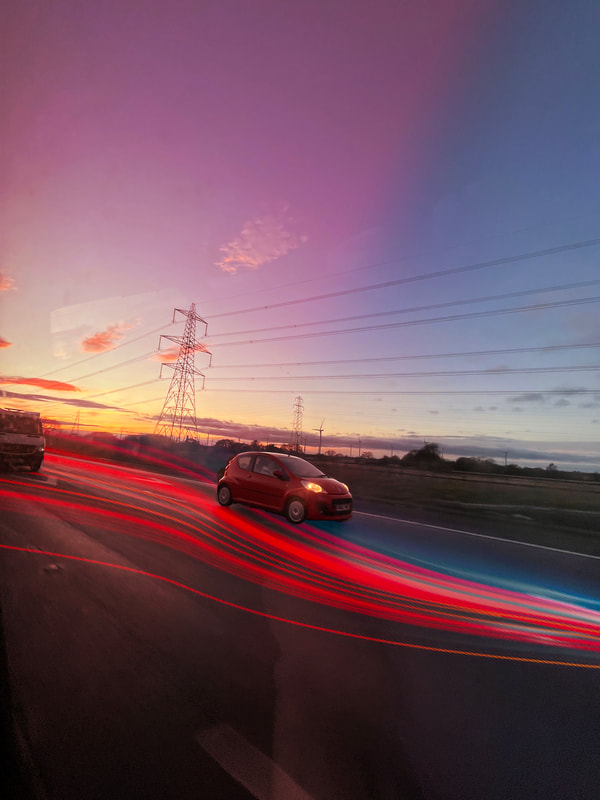
NIGHT STREETS
This is where I really started looking into Liam Wong's work, as you can see I was inspired by his urban photos taken late at night.


Best and Worst
|
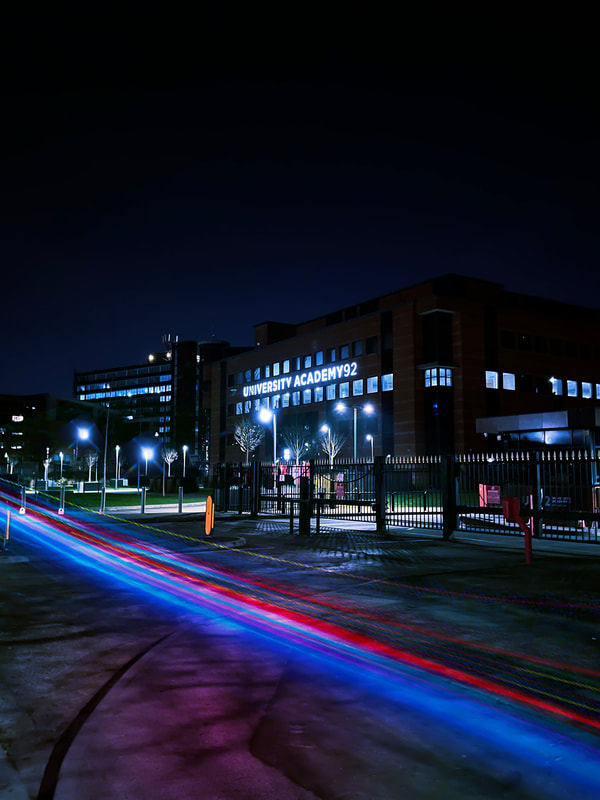
From my perspective, this is my most high quality image. One reason is because of the clear distinction between the black light going into white light, completely contrasting and clashing each other. For me, the leading line is the centre of the three buildings at the top. I wanted this to be the focus of my image because this is where the miniature part of the unique vibrant red neon sign is 'The Point'.
|
This photo stands out to me as the lowest quality compared to others for many reasons. Firstly, the ISO on my phone was too low and I did not let enough light in to the extent that you cannot even see the building's figurine, just the lights that are shaky. I took this photo on a moving vehicle which perhaps explains the shakiness and low quality of the photo. I needed to wait until the tram stopped to get a better, exposed photo. This would also allow me to craft the leading lines of my photo as there isn't one in my opinion here.
|
Experimenting on Photoshop

https://www.youtube.com/watch?v=LvglrRdilw8


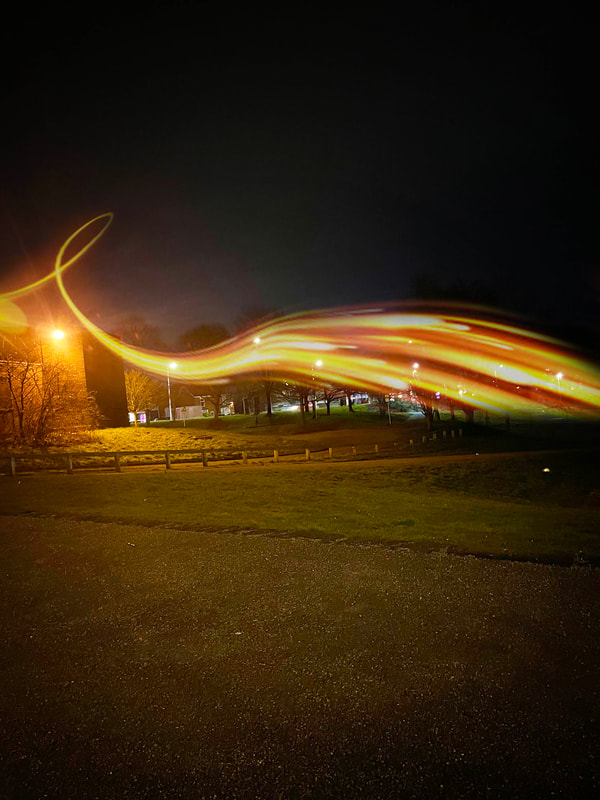
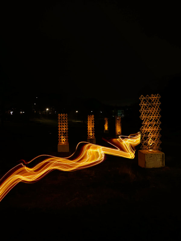
BLACK AND YELLOW


Best and Worst

I think that this is my best image as you can see the trail of lights into the center creating perspective. I had to hold my phone still over a steep bridge to take this photo, it was also very windy and hard to take the photo but in my opinion this proves that I crafted my image well and I'm happy with the result.
|

This is clearly my worst image because of the shakiness of the camera. It is out of focus, high shutter speed and no rule of thirds. The lighting is also blurry and too dark in my opinion. If I held my camera straighter I could've gotten a better image.
|
Experimenting on Photoshop


Best and Worst

I think that this is my best image since it is the one that relates to my mood board the most considering the light is dark enough to create a clear reflection of the boat and building. I adjusted the brightness down to create the low light affect further connecting to my project.
|

I think that this is my worst image because of the high contrast and brightness in my image. Perhaps with photoshop I could enhance the darkness and add more shadows to it so it will fit into my low light theme.
|


SHOOT PLAN
|
For this shoot, I want to experiment with studio shots.
I have tried both urban and portrait at this point and this will be the last experiment before I decide on a final outcome. Similar to my mood boards, I think capturing a flame will give the essence of the low light theme and be crucial that I try working with studio shots. For this I will need. My iPhone 13 camera A window A lighter, lampshade or candle (any light source) Dark room This also links with the black and yellow idea. I will take these photos in my bedroom as it is the easiest access to a window I have. |

|
CANDLE LIGHT


Best and worst
|
In my opinion, this is my most high quality image as it is what I planned to take an image of. The center is of course the lighter which I think creates a clear leading line. Relating to my theme is the reflection, which is a theme I have explored a lot. Overall, I believe this image has a nice low exposure to fit in the low light category and sunset oranges to catch the viewers attention to the bright glowing flame captured.
|

Overall, I'd say this is my worst image due to the clear fuzziness of the candle, this is due to the flame moving too quick for the iPhone's shutter speed and my hand being shaky when trying to find the right angle. I also do not like how the bottom of the candle is cut off as that is supposed to be the main subject in this photo.
|


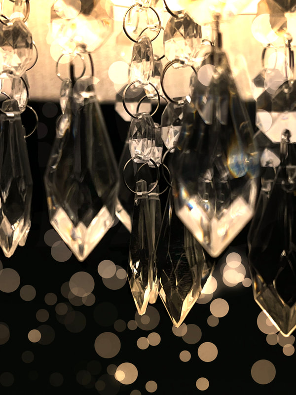
LAMPSHADE


Best and worst

I feel as if this is my best image due to the sharpness of the crystals sharply contrasting with the deep black background. I think the leading line is the two front crystals but the background ones are blurred to draw attention to the front. Due to the refraction from the phone flash against the sides of the crystals ,it has created a slight rainbow which I find very unique.
|

This is conclusively my worst image due to the low quality and time spent crafting the image. The front two crystals on the right block my image and do not allow any focal points through. The image is blurry and low quality. I should have angled it to cut out the front crystals as the camera was way too close to them.
|
PROFFESSIONAL SHOOT (PLAN)
|
When working with Justin on this shoot I will need; candles, tealights, matches, black backdrop, a camera, a tripod and a laptop to process the image.
I want to continue exploring the warm yellowy lights to figure out my theme. Working with Justin will help me bring my ideas to life and reach close, if not better than my mood boards to life. I will come back one day after school to take these photos. My focus of these images is solely on the candle light which is why a black backdrop will draw less attraction, but more to the flame. 
|


|
Setting up the shoot:


The Outcomes:


Best and Worst

I think that this is my best image because of the clear use of the rule of thirds leading the viewers eyes to the candle. I also like the slight shadow beneath the object showing 'sun like' rays. I believe I could definitely enhance this in photoshop.
|

I think that this is my worst image because of the over exposed tone giving it a 'bleached' look. I also feel that it has no clear focus, the accidental shaking hand and the clear fake background does not divert your eyes to the focus, the three candles.
|
Experimenting on Photoshop
For this experiment I needed to darken my background but enhance the candlelight, to do this I had to combine 2 images.
Working with Justin made me realise I do not like studio shots for this theme and I will not continue them.
However I think the yellow light along with black is something I want to work with further.


I decided it did not fit doing studio shots, I decided to carry on with the urban cities at night as I feel it suited my theme the most.
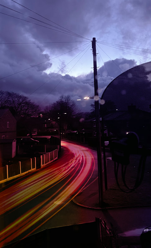
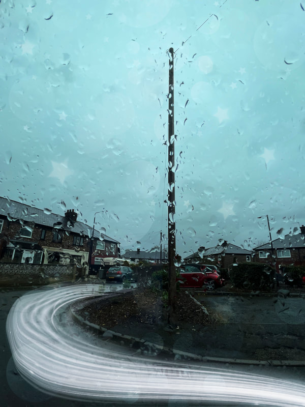
RAINDROPS


Best and Worst

I think that this is my best image because of the deep blue sky creating a moody atmosphere. The leading line would be the streetlamp as it appears to be covered in circular raindrops creating a bokeh affect I can enhance in photoshop.
|

I think this is my worst image because I tried to get a closeup of the singular raindrop it went out of focus and focused on the background instead. It creates a distracting leading line and this photo does nothing for my theme.
|
Experimenting on Photoshop

|

|


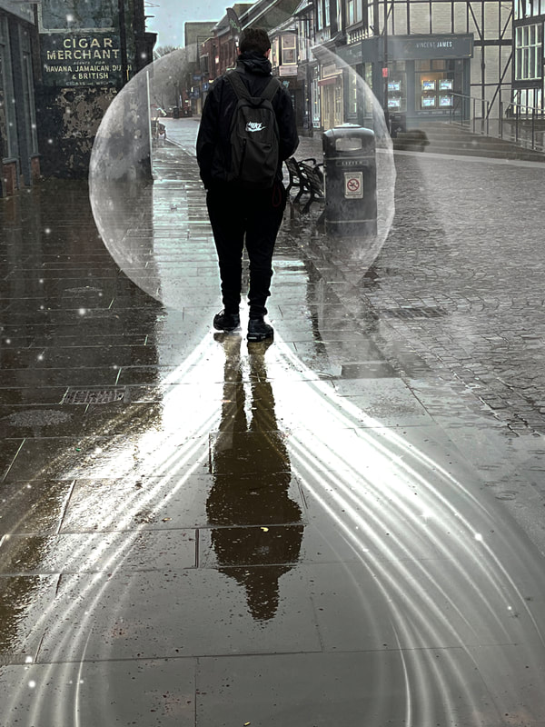
REFLECTIONS
I think this has been my favourite type of images taken so far, I would like to continue with the idea of reflections in puddles, windows etc. . Colours could perhaps be neon or yellow lights reflecting.


I took these 4 images on my way home as the two dots we see were actually Jupiter and Venus. This only happens once a year, so I thought this may also fit Low Light and be interesting for the viewer.
Best and Worst

I think this photo best fits my idea of reflection as if you look closer in you can see the pink lighting follow down the road creating that leading line.
I feel as though the high contrast within the magenta, neon green and royal purple colours bring eyes to my image and make it more attractive. The texture of the concrete floor is still noticeable so you can see that it is in fact a reflection which is what I am aiming for, regarding to Liam Wong's work. |

I think that this is my worst image due to the low composition since it was so zoomed in it made the image very low quality.
Clearly, it is blurry and the lighting isn't sharp. |
Experimenting on Photoshop

|
|
https://www.youtube.com/watch?v=1Ibreg9T168


REFLECTIONS 2


EVALUATION
What was the theme?
For this project, my chosen theme was ‘Low Light’ and I explored the different types such as artificial lights and urban scenes. On the positive side, this theme was good for me because I was able to take images of new scenes that I never had before. Such as sunsets and candlelight’s. As opposed to usually taking portrait photos. Although what I did not like about the theme was that I found it very limited of what I can take photos of (either studio shots or natural urban photography). I preferred to take photos of the night urban scenes overall. Specifically yellow light in the night and reflections in puddles. This theme allowed me to be creative by pushing me out of my comfort zone and really developing the idea of light trails (things I had never heard of) all on photoshop which also improved my skills in my opinion. The theme low-light has such a deep contrast which makes it so appealing to the viewer. Personally, I have always loved looking at the night sky yet when I'd go to capture it on camera, it became too hazy and one dimensional. However, after all my experiments here I have accomplished a 3D (using light trails), great quality set of images of the night sky. This one of the many reasons why I chose this theme as it taught me so much about taking a range of images.
What did I enjoy?
The most interesting part of this theme for me was planning the location of where I would go. This really pushed me to craft my images as I was already thinking of my final outcomes. For example, I did a location shoot in Wales as I know the sunsets there really stand out and would compliment this theme. I also enjoyed finding inspiration for photoshop because it let me enhance my work and bring it to life. I feel as though with this theme I allowed myself to experiment the most. For example, my work went from sunsets to candles to finally deciding on light trails. I know artists like Liam Wong definitely had to plan what day he could take images since with the city, you never know whether it will be raining or sunny, you can't control it. Yet I think Liam used this to his advantage since the rain in his images made the colours look extremely unique. This taught me to work with what I have, be more open minded when taking photos.
New techniques?
The ‘Low light’ theme allowed me to become patient with Photoshop and learn new effects. For the first time in photography, I hadn’t used many tutorials unless I was experimenting with things like the glitch effect. This in my opinion let me become the most creative I ever have since I used previous knowledge and learnt new skills like blending layers together naturally and professionally, I found this hard at first and took lots of experimentation until I was happy with my outcomes. I feel after doing two previous themes, I had finally gotten the hang of photoshop, I was able to do all of my light streaks without a tutorial. As following a tutorial is very frigid and doesn't really let you be creative, not using one allowed me to figure out what I liked and what worked best with my specific image. I could use different lighting like gradient, which you wouldn't get in a typical vague tutorial.
Technique I'd develop further?
To develop my future work further, I definitely want to try and achieve studio shots because of the professional look from working with Justin. After I do this I believe my overall work will look more cleaner and creative. Working with Justin brought imaginative photos to life which is something I aspire to do with my work. If I could redo my project I would have made this more of a priority since it added a sleek look compared to the rest of the images on my exam. I am happy with my photoshop but I know it would look better if the overall quality of my images were better.
Photographers I researched?
During this theme, I researched three photographers; Lindsay Alder who I believe I took inspiration from yet made it my own. Her work on shadows and neon lighting inspired me to take photos of reflections with different kinds of lighting.
My second research, Liam Wong was definitely my favourite to research due to his work of night photography in Tokyo. I took most inspiration from this photographer as I feel he linked the most to my theme.
Finally, Jan Staller who similarly took photos of urban nights yet really focused on the framing of their photos. I believe I was influenced yet by this such as their techniques to plan shoots definitely made it my own by experimenting with all kinds of photos, angles, colours and more.
How did they specifically inspire me?
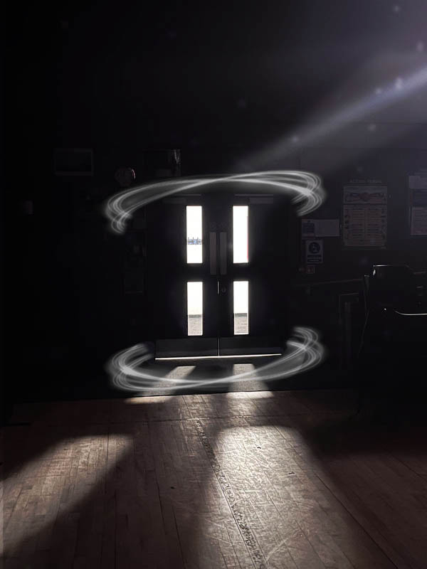
Firstly, Lindsay Alder specifically inspired me with the colours used in her images, I used her as inspiration when I took photos of the traffic lights reflecting on to the road showcasing rainbow colours. I made it my own with the idea of reflections of lights which I heavily enjoyed taking photos of. She also frequently used shadows, which I used in my PEXA experiment of the doors.
Liam Wong brought the dark nights into vibrant cities which inspired me to go out on location shoots and craft my images in the best way to bring out all the potential colours. For example, when I experimented with yellow lights and my 'Night streets' category.
Jan Staller: The composition of Jan's work is what stood out to me the most and influenced me to focus on what angle I should be taking my photos and how to use perspective to focus on certain areas of an image. This work inspired me to try and achieve the 'water droplets on window' as I had to get it just right to ensure you could still see the background behind the raindrops.
Technique I enjoyed?
My favourite effect was practising light streaks on photoshop, the best tool for this I believe was the 'Bubic' effect which is where you can stretch out an overlay to make it perfectly wrap around an object and make any chosen thing 3D.
In my opinion this gave me a high level outcome as it is probably the most developed photoshop effect I've experimented with and was the most difficult which was a nice challenge. I didn't even need a tutorial once I had practiced enough, this proved I am learning skills that I can take away with me when I leave the school.
Most successful?
The most successful part of this project for me was a specific shoot. In my opinion, the 'Black and yellow' shoot as it fit the low light theme the most due to neon colours and dark streets contrasting which fits into my mood boards. This helped me the most with my final outcomes since I feel strongly that the yellow light streaks almost made my images glow in the dark. Mainly though, to do this I had to plan my own shoots from home which I feel was very successful as nearly all of my photos I planned myself.
What'd I learn?
I think that I have used the techniques I learnt through consistently researching and looking for inspiration of what I could potentially experiment with next which I think you can see throughout my work. Due to the constant experimentation, I had to go on a journey of constantly editing and changing my mood boards to ensure they were still relevant to my work. My mood boards helped me to envision my final outcomes and focus on that. Specific research references were my 3 artists' research; Jan Staller, Liam Wong and Lindsey Alder and also either Google or Pinterest. I learnt that photography is a journey and it is okay to experiment since it is how we learn. As long as you find your end goal by the end then your work has meaning.
What could I improve on?
One thing I think worked well for me was organising my own shoots from home because almost all my photos were my own shoots. However, if I could restart 'Low Light' I would definitely have chosen different things to photograph and possibly less experimentation and stick to one main thing. I think I struggled with this the most due to this specific theme being so broad into what I could take photos of. It was difficult choosing whether studio shots and the type of lights to do. Types of things I might've photographed were cars, fairy lights etc. I believe if I'd given myself more time to plan my images at the start, I could have crafted my images better, perhaps used my camera at home and work on framing, I could've planned days based on the weather to shoot, all of the small things could have given me higher quality photos.
For this project, my chosen theme was ‘Low Light’ and I explored the different types such as artificial lights and urban scenes. On the positive side, this theme was good for me because I was able to take images of new scenes that I never had before. Such as sunsets and candlelight’s. As opposed to usually taking portrait photos. Although what I did not like about the theme was that I found it very limited of what I can take photos of (either studio shots or natural urban photography). I preferred to take photos of the night urban scenes overall. Specifically yellow light in the night and reflections in puddles. This theme allowed me to be creative by pushing me out of my comfort zone and really developing the idea of light trails (things I had never heard of) all on photoshop which also improved my skills in my opinion. The theme low-light has such a deep contrast which makes it so appealing to the viewer. Personally, I have always loved looking at the night sky yet when I'd go to capture it on camera, it became too hazy and one dimensional. However, after all my experiments here I have accomplished a 3D (using light trails), great quality set of images of the night sky. This one of the many reasons why I chose this theme as it taught me so much about taking a range of images.
What did I enjoy?
The most interesting part of this theme for me was planning the location of where I would go. This really pushed me to craft my images as I was already thinking of my final outcomes. For example, I did a location shoot in Wales as I know the sunsets there really stand out and would compliment this theme. I also enjoyed finding inspiration for photoshop because it let me enhance my work and bring it to life. I feel as though with this theme I allowed myself to experiment the most. For example, my work went from sunsets to candles to finally deciding on light trails. I know artists like Liam Wong definitely had to plan what day he could take images since with the city, you never know whether it will be raining or sunny, you can't control it. Yet I think Liam used this to his advantage since the rain in his images made the colours look extremely unique. This taught me to work with what I have, be more open minded when taking photos.
New techniques?
The ‘Low light’ theme allowed me to become patient with Photoshop and learn new effects. For the first time in photography, I hadn’t used many tutorials unless I was experimenting with things like the glitch effect. This in my opinion let me become the most creative I ever have since I used previous knowledge and learnt new skills like blending layers together naturally and professionally, I found this hard at first and took lots of experimentation until I was happy with my outcomes. I feel after doing two previous themes, I had finally gotten the hang of photoshop, I was able to do all of my light streaks without a tutorial. As following a tutorial is very frigid and doesn't really let you be creative, not using one allowed me to figure out what I liked and what worked best with my specific image. I could use different lighting like gradient, which you wouldn't get in a typical vague tutorial.
Technique I'd develop further?
To develop my future work further, I definitely want to try and achieve studio shots because of the professional look from working with Justin. After I do this I believe my overall work will look more cleaner and creative. Working with Justin brought imaginative photos to life which is something I aspire to do with my work. If I could redo my project I would have made this more of a priority since it added a sleek look compared to the rest of the images on my exam. I am happy with my photoshop but I know it would look better if the overall quality of my images were better.
Photographers I researched?
During this theme, I researched three photographers; Lindsay Alder who I believe I took inspiration from yet made it my own. Her work on shadows and neon lighting inspired me to take photos of reflections with different kinds of lighting.
My second research, Liam Wong was definitely my favourite to research due to his work of night photography in Tokyo. I took most inspiration from this photographer as I feel he linked the most to my theme.
Finally, Jan Staller who similarly took photos of urban nights yet really focused on the framing of their photos. I believe I was influenced yet by this such as their techniques to plan shoots definitely made it my own by experimenting with all kinds of photos, angles, colours and more.
How did they specifically inspire me?
Firstly, Lindsay Alder specifically inspired me with the colours used in her images, I used her as inspiration when I took photos of the traffic lights reflecting on to the road showcasing rainbow colours. I made it my own with the idea of reflections of lights which I heavily enjoyed taking photos of. She also frequently used shadows, which I used in my PEXA experiment of the doors.
Liam Wong brought the dark nights into vibrant cities which inspired me to go out on location shoots and craft my images in the best way to bring out all the potential colours. For example, when I experimented with yellow lights and my 'Night streets' category.
Jan Staller: The composition of Jan's work is what stood out to me the most and influenced me to focus on what angle I should be taking my photos and how to use perspective to focus on certain areas of an image. This work inspired me to try and achieve the 'water droplets on window' as I had to get it just right to ensure you could still see the background behind the raindrops.
Technique I enjoyed?
My favourite effect was practising light streaks on photoshop, the best tool for this I believe was the 'Bubic' effect which is where you can stretch out an overlay to make it perfectly wrap around an object and make any chosen thing 3D.
In my opinion this gave me a high level outcome as it is probably the most developed photoshop effect I've experimented with and was the most difficult which was a nice challenge. I didn't even need a tutorial once I had practiced enough, this proved I am learning skills that I can take away with me when I leave the school.
Most successful?
The most successful part of this project for me was a specific shoot. In my opinion, the 'Black and yellow' shoot as it fit the low light theme the most due to neon colours and dark streets contrasting which fits into my mood boards. This helped me the most with my final outcomes since I feel strongly that the yellow light streaks almost made my images glow in the dark. Mainly though, to do this I had to plan my own shoots from home which I feel was very successful as nearly all of my photos I planned myself.
What'd I learn?
I think that I have used the techniques I learnt through consistently researching and looking for inspiration of what I could potentially experiment with next which I think you can see throughout my work. Due to the constant experimentation, I had to go on a journey of constantly editing and changing my mood boards to ensure they were still relevant to my work. My mood boards helped me to envision my final outcomes and focus on that. Specific research references were my 3 artists' research; Jan Staller, Liam Wong and Lindsey Alder and also either Google or Pinterest. I learnt that photography is a journey and it is okay to experiment since it is how we learn. As long as you find your end goal by the end then your work has meaning.
What could I improve on?
One thing I think worked well for me was organising my own shoots from home because almost all my photos were my own shoots. However, if I could restart 'Low Light' I would definitely have chosen different things to photograph and possibly less experimentation and stick to one main thing. I think I struggled with this the most due to this specific theme being so broad into what I could take photos of. It was difficult choosing whether studio shots and the type of lights to do. Types of things I might've photographed were cars, fairy lights etc. I believe if I'd given myself more time to plan my images at the start, I could have crafted my images better, perhaps used my camera at home and work on framing, I could've planned days based on the weather to shoot, all of the small things could have given me higher quality photos.
21st April, first exam, I will not add anymore information or make any changes to the work above.
EXAM OUTCOMES


At this point in my exam, I decided I only wanted to do landscape photos and no text.


FINAL GALLERY
NON-COLOUR
|
|
COLOUR