Alphabet project
a b c d e f g h i j k l m n o p q r s t u v w x y z


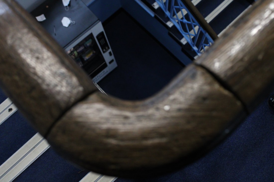


In my opinion the Y is my best image because I think it displays the best leading lines as personally, my eyes follow from the outer corners of the Y and follow to the end of the letter.
I also think this image is quite creative because of the lavender purple colours contrasting to the dark night sky.
Another reason it could be creative is that is is just the top of the Salford Quays bridge
but I have taken it at an angle where is resembles a Y shape. Compared to my other photos, I haven't had to make the image into this letter and it is more natural.
For example, my X was created with two chairs meaning it wasn't natural.

Portrait Photography
I chose portrait photography for my theme as it was a nice break from the texture, but it also allows me to enhance my photoshop skills and combine it into the texture project because I have recently been practicing Double Exposure using these images on photoshop, this can make my work more unique, personal and stand out to a viewer. I enjoyed using composition techniques like different filters (week 3), makeup (week one and two) and finally, lighting. I hope to continue portrait photography in the future as experimenting on photoshop with this theme is the most eye-catching in my opinion because you can look at 100 photos of different leaves and get bored, however faces can be unique, 100 faces and they could look completely different. Also, combining the two with double exposure increases the development of your photography.
Week one


Portrait Kaleidoscope


www.youtube.com/watch?v=Soa2EU0HAfc
The tutorial was easy to follow. I'm not sure if I like the effect itself, but I am happy with the outcome. Possibly this photo wasn't right for the effect.
The tutorial was easy to follow. I'm not sure if I like the effect itself, but I am happy with the outcome. Possibly this photo wasn't right for the effect.


